Photographing products on a solid colour background.
In a previous post, we discussed the option of capturing your images on a white background and deep etching them so that all of the backgrounds match when seen in a typical online store feed. In this post, I’d like to discuss the option of shooting your objects on a colour or tone.
Capturing your individual products on a subtle colour that connects to your brand style guide can tell us something about the product. For example, an earthy, organically formed ceramic bowl would resonate more with its audience on a natural tone as opposed to a stark and clinical white. Choosing a light, warm beige instead of white might be a better choice in this scenario and this tone would communicate and further enhance the earthy and organic feel.
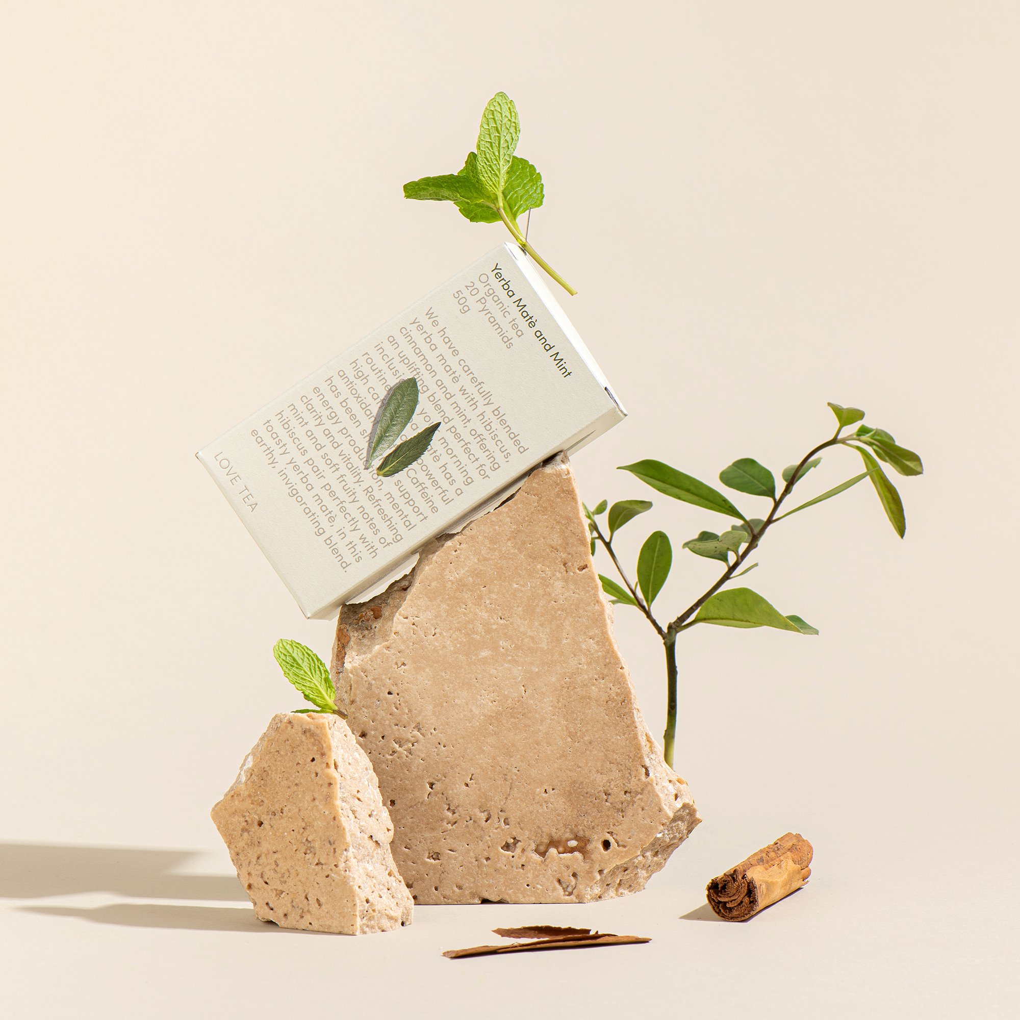
This product image has been captured on a neutral tone with crispy shadows that accentuate the form of the packaging and highlight the natural elements associated with the brand. The simplicity and use of negative space makes it an easy image to use as an ecommerce listing whilst having enough aesthetics for social posts.
The catch with choosing a colour for your product listings, is being able to choose a tone that doesn’t impact or change the colour of the product itself. When you light a product to be photographed, the light bounces around everywhere. As it bounces around it reflects off all of the surfaces in the scene and this can create colour casts where they are not wanted. For example, if you were selling a beautiful white cup and you choose a blue background to shoot the white cup on, the cup may suddenly appear grey or a shade of blue due to the reflections. This is a huge factor to be aware of, as listing colours as close as you can to the real product is essential so that you don’t have a mountain of returns.
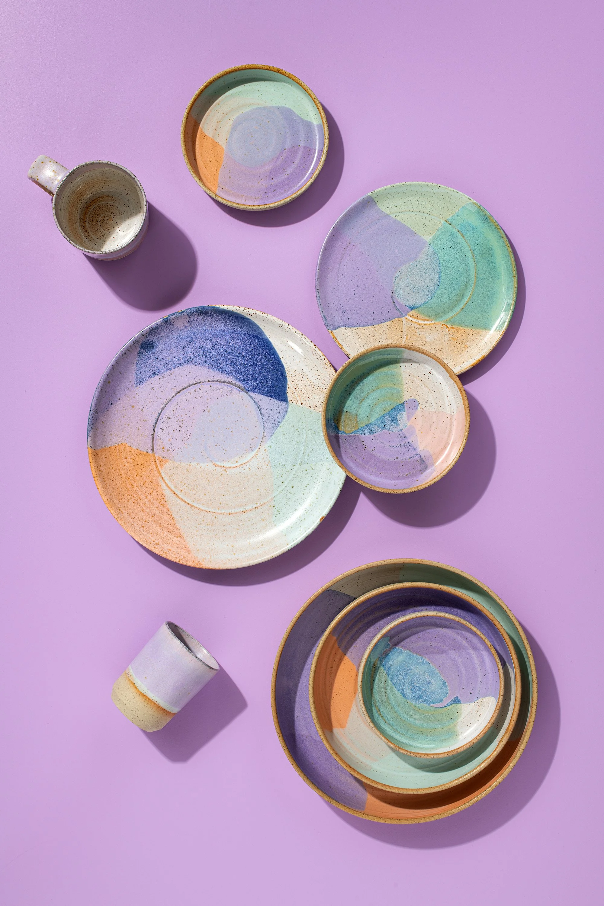
This product image has been captured on quite and intense colour. However in this situation it works because the lilac is found within the ceramics and is also part of this brands colour palette. The shot has been captured as a flatlay so reflections from the board onto the product are not as much of an issue.
If you successfully find a colour that works for your brand and the products you are selling, this kind of photography can be great as it has a multi purpose. A product on a solid colour is more visually pleasing on social media posts than one that is on white (amazon vibes). Therefore, it can be used as a product listing, for socials and if you add one or two props, you can have lovely minimalistic styled images.
Lighting, camera angle and working with shadows can also heighten the visual appeal of a simple product image.
Simply styled images are a great way to communicate something about the product and to target the right audience. An example of this is styling the product with its ingredients. This gives the audience an immediate clue as to what the main ingredient in the product is and how you choose to style this will make it attractive to the right crowd. You can take this a step further and group your products so that you have even more content and more to talk about with your audience. When using this method of product photography, you are making your listings cohesive through curating colours and textures that support the product. If each background is not identical and there are slight colour shifts in the background, it isn’t as noticeable as it appears more organic. In comparison, a feed of different toned whites just looks like over and underexposed images.
Styled ecommerce images require more organising and curating than photographing products on white. However, they are more versatile in their use. You can change the background colour of a product captured on white, but the product has to be a simple shape without intricate details. You also need to be reasonably skilled so that the result looks lovely and natural and doesn’t look like a photoshop cutout from a high school project!
What are your brand colours? What tones would suit your products?
Subscribe here to receive a step by step guide on how to style and capture your products in a minimal, calm aesthetic.


